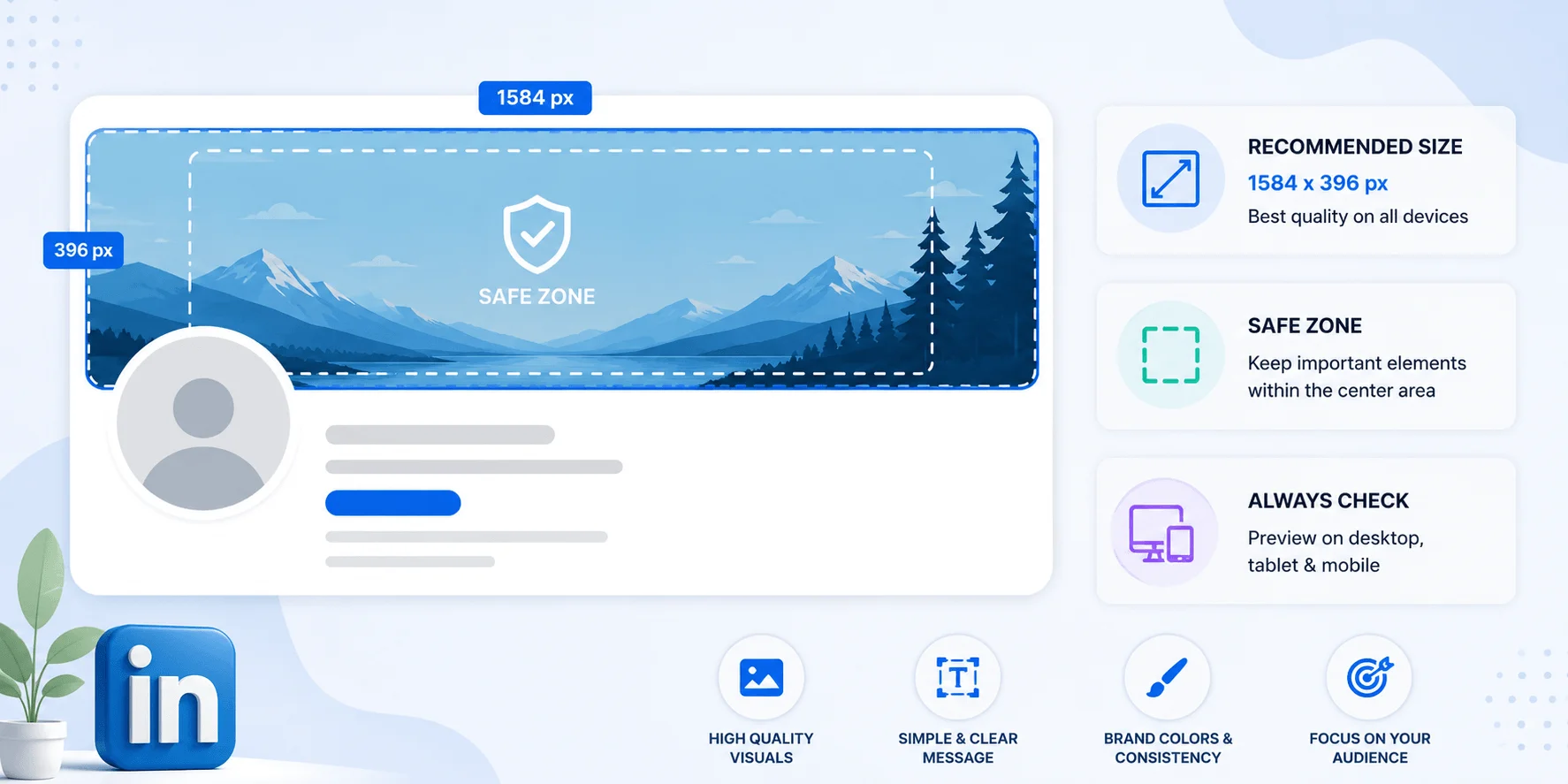
The correct LinkedIn cover image size is 1584 x 396 pixels, a 4:1 aspect ratio, under 8 MB, in JPG or PNG.
That's the answer. You can go design your banner now.
But if you've ever uploaded a banner that looked perfect in Canva and then turned into a blurry, awkwardly-chopped mess on your phone — stick around. Because I've spent the last few weeks pulling apart every spec sheet, help doc, and rendering quirk on this topic, and I found something interesting.
Almost every article about LinkedIn banner dimensions tells you the number and stops.
None of them tell you why your text keeps disappearing.
Let me fix that.
Here's the thing about this question: it sounds simple, and it mostly is. But LinkedIn uses about four different names for the same rectangle, which trips people up constantly. So before we get into pixels, let's clear the fog. Your LinkedIn cover photo size, your LinkedIn background photo size, your LinkedIn header image size, and your LinkedIn banner size are all the exact same thing on a personal profile. One asset. One number. Different labels depending on which help page you landed on.
The number is 1584 x 396 pixels.
LinkedIn's own interface calls it "background photo" on personal profiles and "cover image" on Company Pages. Hootsuite's August 2026 image size guide lists it as cover photo. Sprout Social calls it a cover photo too.
Same rectangle. Don't overthink it.
I'm going to give you every number in one place, because scattered specs are how people end up with a pixelated banner.
Spec | Value |
|---|---|
Recommended dimensions | 1584 x 396 px |
Aspect ratio | 4:1 |
Minimum accepted size | 1192 x 220 px |
Maximum file size | 8 MB |
Supported formats | JPG, PNG, GIF |
Quick warning on that minimum.
Yes, LinkedIn will accept 1192 x 220. No, you shouldn't use it. Uploading below the full recommendation risks visible blur on high-DPI retina displays, because LinkedIn upscales your smaller source file to fill the space. And upscaling never goes well.
Export at 1584 x 396. Every time.
This is the single most common mistake I see, and it's an expensive one because it doubles your design work. Your personal profile banner and your LinkedIn Company Page cover are separate assets with genuinely different pixel dimensions. They're not interchangeable. Reusing one for the other is the fastest reliable way to produce something stretched, cropped, or embarrassing. So plan for two files from the start.
Personal profile: 1584 x 396 px (4:1)
Company Page: 1128 x 191 px displayed (roughly 6:1)
But here's a wrinkle worth knowing. For Company Pages, you upload at 4200 x 700 px — PNG or JPG, max 3 MB — and LinkedIn renders it down to ~1128 x 191 on the page. So the upload spec and the display spec are different numbers.
Confusing? A little.
Important? Very.
If you're setting up a business presence from scratch, our guide to building a LinkedIn Company Page walks through the full asset checklist.
Now we're getting to the part nobody writes about properly. You can nail the LinkedIn cover image size perfectly and still end up with your name hidden behind your own headshot. That's because your circular profile photo physically sits on top of the banner, and LinkedIn's layout shifts depending on the device. The safe zone is the central region that survives every screen size. Design inside it and you're bulletproof. Ignore it and you're gambling.
Let me show you what's actually happening.
Your circular profile picture overlaps the bottom-left corner of the banner — roughly 200 px from the left edge and 150 px from the bottom on desktop.
On mobile? It's proportionally larger and eats even more.
The practical rule from Moda's banner guide: keep important content at least 300 px from the left edge, and put your text in a roughly 1000 x 250 px area in the center-right.
That's your sweet spot.
While you're in there, it's worth getting your headshot right too — see our LinkedIn profile photo guide for the circular crop rules.
Here's where I have to be straight with you, because I checked three reputable sources and got three different answers. That's unusual, and it tells you something: LinkedIn doesn't publish an official safe-zone figure, so everyone is reverse-engineering it from device testing. The spread isn't huge, but it's real, and you should know about it before you trust any single number.
The three figures I found:
1350 x 220 px centered
1260 x 300 px centered
1000 x 250 px center-right
Notice the overlap.
If you keep everything critical inside roughly 1000 x 220 px, centered and shifted slightly right, you satisfy all three. That's the conservative play, and it's what I'd do.
LinkedIn's own Pages image specifications back the general principle — they recommend limited text and keeping key details away from the edges, especially the lower-right corner on Company Pages.
Different corner, same lesson. Center your message.
Most of your profile views happen on a phone. That single fact should drive every design decision you make, because mobile rendering is consistently less forgiving than desktop — tighter crops, a proportionally larger profile photo, and far less room for anything subtle. A banner that reads beautifully on a 27-inch monitor can be completely illegible in someone's hand. So build in margin you don't think you need.
My rule: leave an 80 px buffer at the top and bottom of your canvas. Nothing important goes there.
It costs you nothing and it saves you a re-upload.
Format choice sounds like a technical footnote, but it's actually where a lot of "why is my banner blurry" complaints originate. Each format handles different content types in wildly different ways, and choosing wrong means either a soft, mushy image or a file too heavy to render cleanly. If you want the deeper background on why this happens, our breakdown of vector vs raster images explains exactly what's going on under the hood. Otherwise, here's the short rule.
Use JPG for photographic backgrounds. Smaller file size, no visible quality loss on photos.
Use PNG for anything with text overlays, logos, or hard graphic edges. PNG keeps those edges crisp — JPG compression turns them fuzzy.
Skip GIF entirely. LinkedIn accepts it, but only renders the first frame. So you get zero animation and a decent chance of an unflattering frozen moment.
And no, before you ask — LinkedIn does not support animated banners or video backgrounds in the cover slot. Personal profiles or Company Pages. It's a single static image, full stop.
While you're in your design tool, you may as well fix everything else. A perfect banner sitting above a 200-pixel profile photo still reads as a neglected profile, and recruiters clock that instantly. Here's the full reference set so you don't have to open six more tabs. I've cross-checked these against Hootsuite, Sprout Social, and Dash Social's platform guide, all updated in 2026.
Asset | Size |
|---|---|
Profile photo | 400 x 400 px minimum (800 x 800 recommended) |
Personal cover image | 1584 x 396 px |
Company Page logo | 300 x 300 px |
Company Page cover | 4200 x 700 px upload |
Life tab hero image | 1128 x 376 px |
Event cover | 1776 x 444 px |
Feed post image | 1200 x 627 px |
Link preview | 1200 x 627 px |
One note on profile photos: LinkedIn crops them to a circle, and they display as small as 56 px in comments. Center your face. The square corners you uploaded are invisible.
Need the numbers for other platforms too? Our social media image sizes cheat sheet covers all nine major networks.
Organic and paid follow completely different rules, and mixing them up wastes budget rather than just looking sloppy. Ad creative gets served across the feed, the right rail, and the inbox, and each placement has its own constraints. Worth bookmarking if you touch campaigns at all.
Ad format | Image size | Max file size |
|---|---|---|
Single image (landscape) | 1200 x 627 px | 5 MB |
Single image (square) | 1200 x 1200 px | 5 MB |
Carousel card | 1080 x 1080 px | 10 MB |
Message ad banner | 300 x 250 px | 2 MB |
Text / Spotlight ad logo | 100 x 100 px | 2 MB |
If you only produce one size, make it square. LinkedIn recommends 1:1 for consistent delivery across desktop and mobile, and it occupies more screen space in a mobile feed than landscape does.
Alright — you've got the specs, you've got the safe zone, you know your format. Now let's actually get this thing live. The upload flow is genuinely quick, but there are two steps in the middle that most people skip, and skipping them is exactly how you end up re-uploading three times. Follow all six and you'll be done in under four minutes.
Step 1 — Set your canvas to 1584 x 396. Not "close to." Exactly. Every major design tool has a LinkedIn banner preset.
Step 2 — Draw your safe zone. Add temporary guides: 300 px in from the left, 100 px from every other edge. Keep all text and logos inside.
Step 3 — Export correctly. PNG if there's text. JPG if it's a photo. Check the file is under 8 MB.
Step 4 — Upload it. Go to your profile, click the camera icon on the banner area, select your file, and click Apply.
Step 5 — Check it on desktop. Look specifically at the bottom-left. Is anything hiding behind your headshot?
Step 6 — Check it on your phone. This is the step people skip. Mobile crops harder than desktop, always. If it survives both, you're finished.
If your banner uploaded soft or pixelated, it's almost always one of three causes. Run through them in order, because the fix for each one is completely different and guessing wastes an afternoon.
LinkedIn upscaled your file to fit the slot, and upscaling always softens edges. Re-export from your original at full resolution.
Lossy compression destroys letterforms and logo edges first. Switch that file to PNG and the problem usually disappears entirely.
Don't pre-compress. LinkedIn applies its own compression on top of yours, and stacking two passes is what produces that muddy look. Upload the clean export.
LinkedIn's own guidance on blurry Page covers says the same thing in fewer words: use a larger, higher-quality source file.
Getting the LinkedIn cover image dimensions right is the technical half. The other half is having something worth putting there — and this is where most profiles quietly waste 1584 x 396 pixels of free branding real estate. That strip is the largest visual element on your profile. It loads before anyone reads your headline. Treat it like a billboard, not a screensaver.
A few directions that reliably land:
A short, specific tagline that reinforces your headline. Not a quote. A positioning statement. If your headline isn't pulling its weight yet, fix that first — these LinkedIn headline examples will give you something worth echoing.
Your niche, stated plainly. Something like "Product Design · B2B SaaS" does more work than a stock photo of a skyline.
A clean visual from your actual field — your workspace, a portfolio piece, your product.
Contact details, if you're job hunting. Your email or portfolio URL, placed center-right where it survives cropping.
And one rule above all: less is more.
Busy banners with small type look fine on your monitor and completely illegible on a phone. Use large text. Use high contrast. Your banner is one piece of a bigger picture, so it's worth reading our full LinkedIn personal branding guide to make sure every element is telling the same story.
1584 x 396 pixels at a 4:1 aspect ratio, under 8 MB, exported as PNG or JPG. That's the recommended LinkedIn banner size for personal profiles in 2026.
Mobile renders the banner with tighter cropping and a proportionally larger profile photo. Keep all critical content inside the central safe zone — roughly 1000 x 220 px, shifted slightly right of center.
No. Personal profiles use 1584 x 396 px; Company Pages use a 4200 x 700 px upload displayed at 1128 x 191. The aspect ratios are different enough that cross-use produces a stretched or cropped result.
No. GIF uploads render as a static first frame, and video backgrounds aren't supported in the cover slot at all.
1192 x 220 px is the technical minimum, but uploading at minimum causes visible blur on high-resolution screens. Always export at the full 1584 x 396.
PNG for designs containing text or logos, JPG for photographic backgrounds. PNG preserves sharp edges that JPG compression would soften.
Your banner is the first thing anyone sees on your profile — before your headline, before your experience, before a single word of your bio.
Now you know exactly how to get it right.
Go fix yours.

Daniel Harper is a B2B marketing consultant who helps professionals and founders grow their LinkedIn presence through smart engagement strategies. He writes about AI tools, reply tactics, and building authentic professional networks that actually convert.
AIReplyBee is your AI-powered LinkedIn reply generator that helps you create authentic, engaging responses in seconds.
Generate your first replyWhat is a collaboration post? Learn how Instagram collab posts work, why they boost reach, and how to set one up step-by-step.
InMail on LinkedIn lets you message anyone, even outside your network. See how it works, pricing, credits, and tips to boost replies.
Learn how to use ChatGPT effectively with the PTCF framework, 7 practical steps, and a real before/after example that actually works.